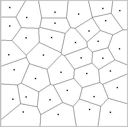
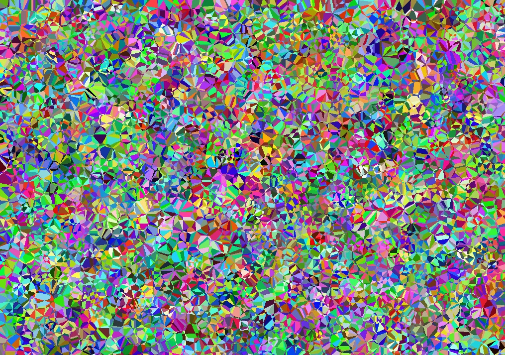
 Voronoi art – until I think of what else to call it! They evolved from Voronoi diagrams: dots are plotted randomly (or from data), then lines drawn around each dot, around the points closer to it than to any other.
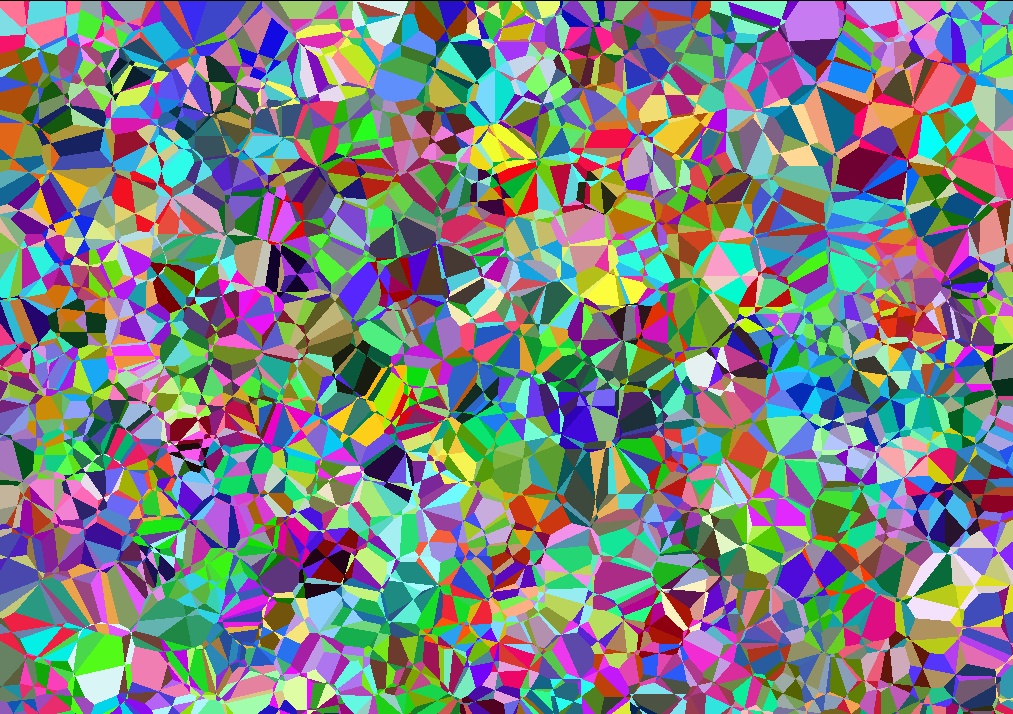
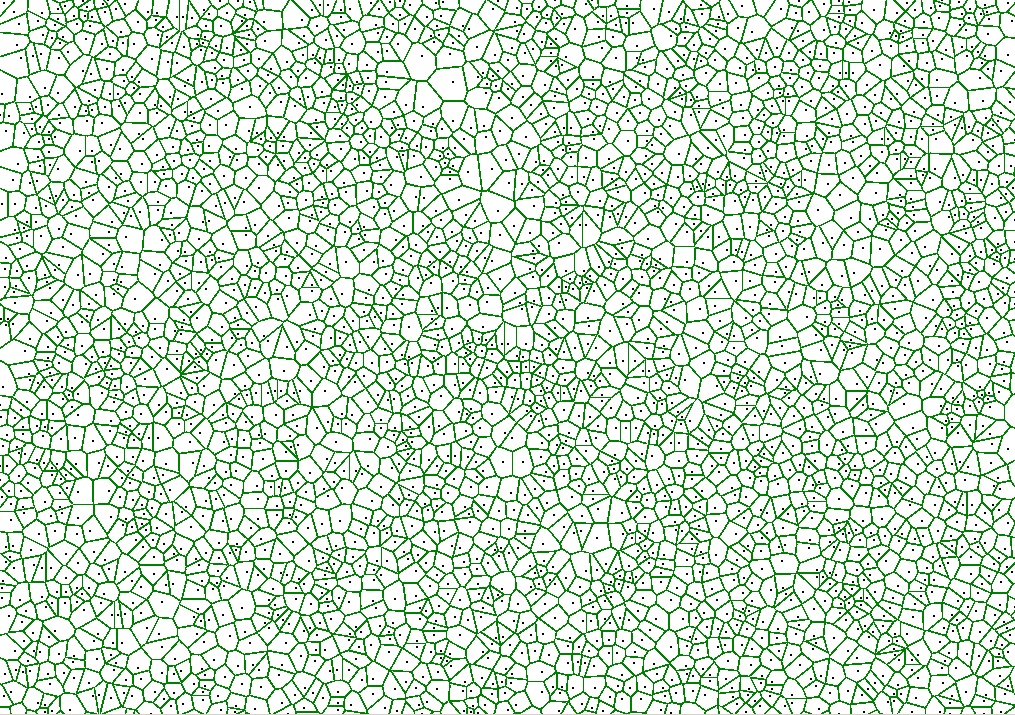 Coloured randomly, they look like this:
 In all following pictures, each dot was assigned a colour randomly.
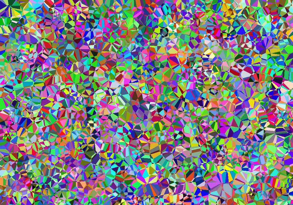
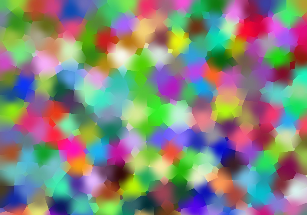
Coloured so that each pixel has the colour of the second-closest dot:
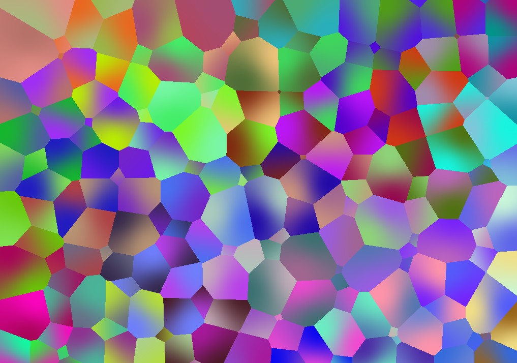
 Coloured a weighted average of the two closest dots, i.e. travelling from a blue to a green dot, the colour smoothly changes from blue to green:
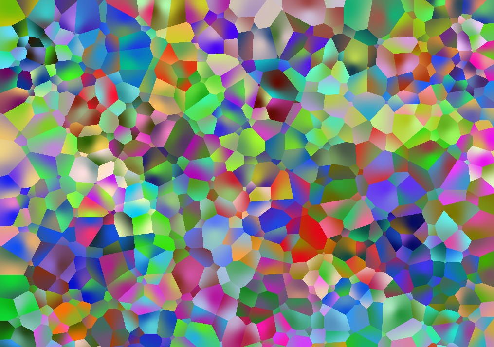
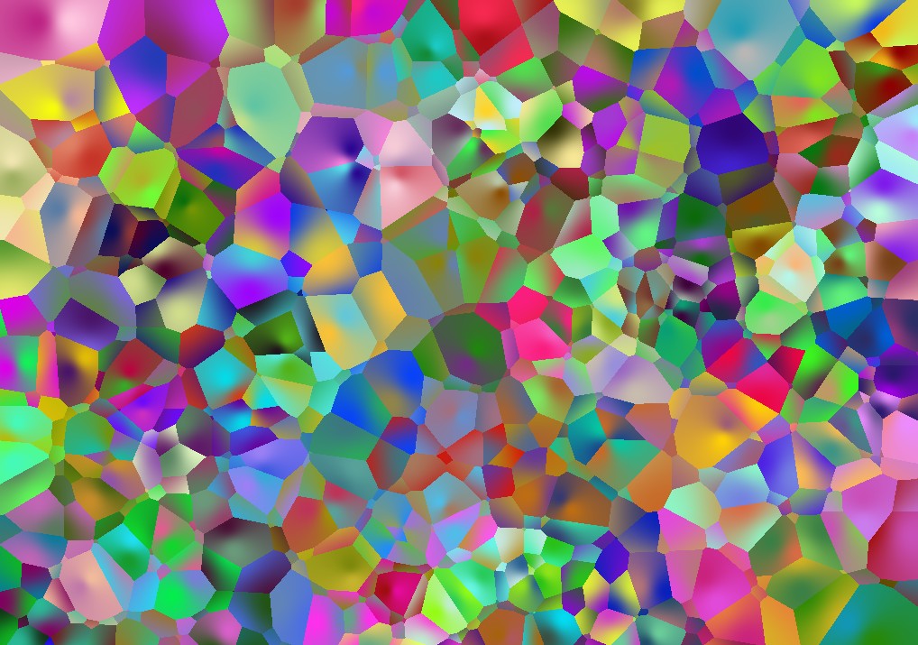
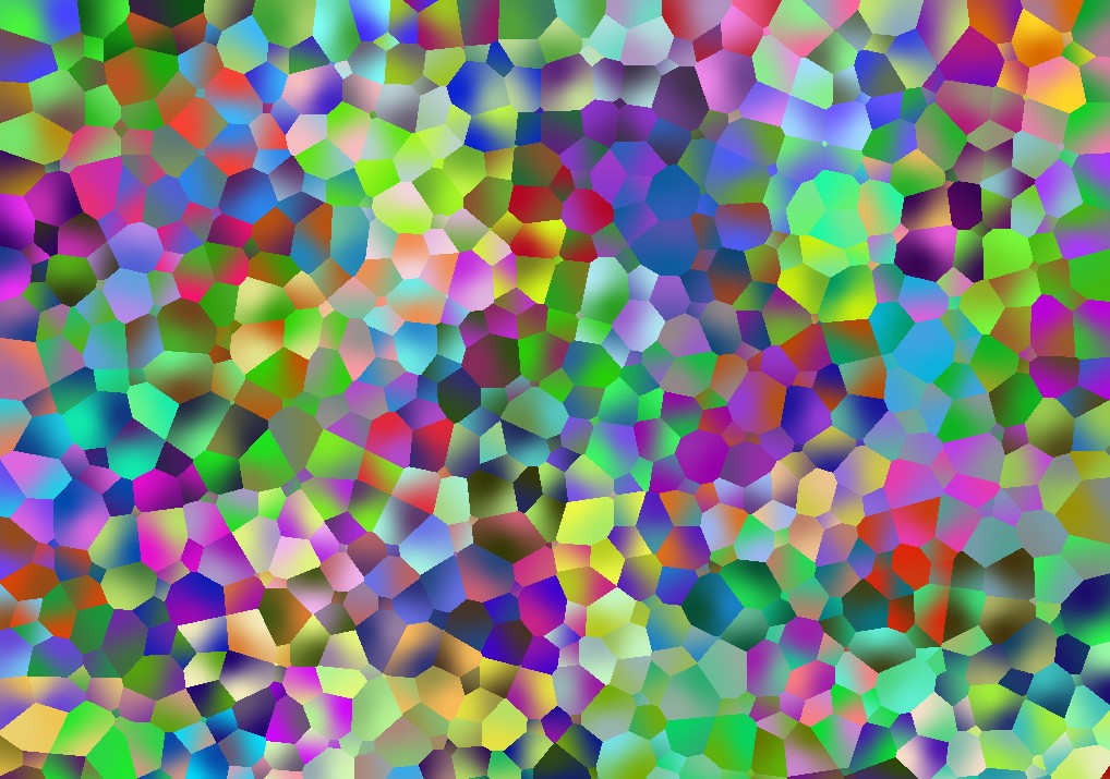
 Artistically most exciting was when I tried a combination of these two ideas: smooth colour gradations, but closest and second closest dots flipped in the algorithm, so that i.e. nearing the green dot, the colour becomes more blue.


to be continued.